Naima Mohamed
I am Naima Mohamed, a designer and project manager who builds meaning before form. My work spans brand identity, campaigns, editorial, packaging, and information design, but what connects all of it is that I start with a question worth asking before I pick up a tool. I grew up navigating systems without a guide, lived across cultures, and that experience shaped how I see design: not as decoration, but as infrastructure for how people understand themselves and the world around them. My capstone, SUB30, is a human dignity campaign for young adults who grew up without a stable foundation, being the most direct expression of why I do this work. I’m drawn to problems that are structural, environments where the pace is high, and work that actually lands for the people it’s made for.
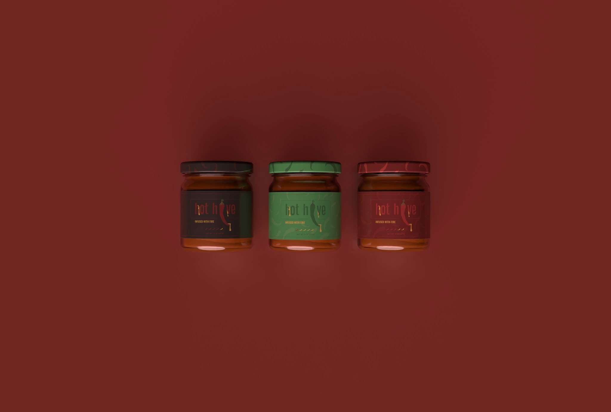
Hot Hive — Hot Honey Packaging Design
Most hot honey packaging buries the heat. The brief was to hold both identities of sweet and spicy in the packaging. The process started with a competitive audit, then paper maquettes before ever opening Illustrator. Glass over plastic for shelf confidence and sustainability. Wide-rim jar for accessibility. The wordmark solved a specific problem iteratively: the chili pepper as the “i” dot in Hive kept reading as a “j” until the pepper was straightened and the dot reintroduced. Color, spice indicators, and label hierarchy were placed where a real buyer expects them because familiarity builds trust before the taste does.
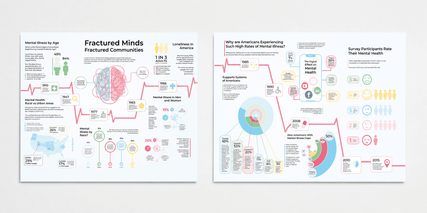
Fractured Minds, Fractured Communities — Information Design
A research-to-design pipeline executed across three phases: six data visualizations, two large-scale infographic panels, and a motion graphic, all built independently from shared group research. The design argument is structural and mental illness in America follows geography, race, and economic erosion, not just individual psychology. A semantic color system, four-weight typographic hierarchy, and a consistent 6x4 grid hold both panels in sequence. Each chart type was chosen based on what question the data was answering. The motion graphic then works out what shifts when an audience is watching instead of reading.
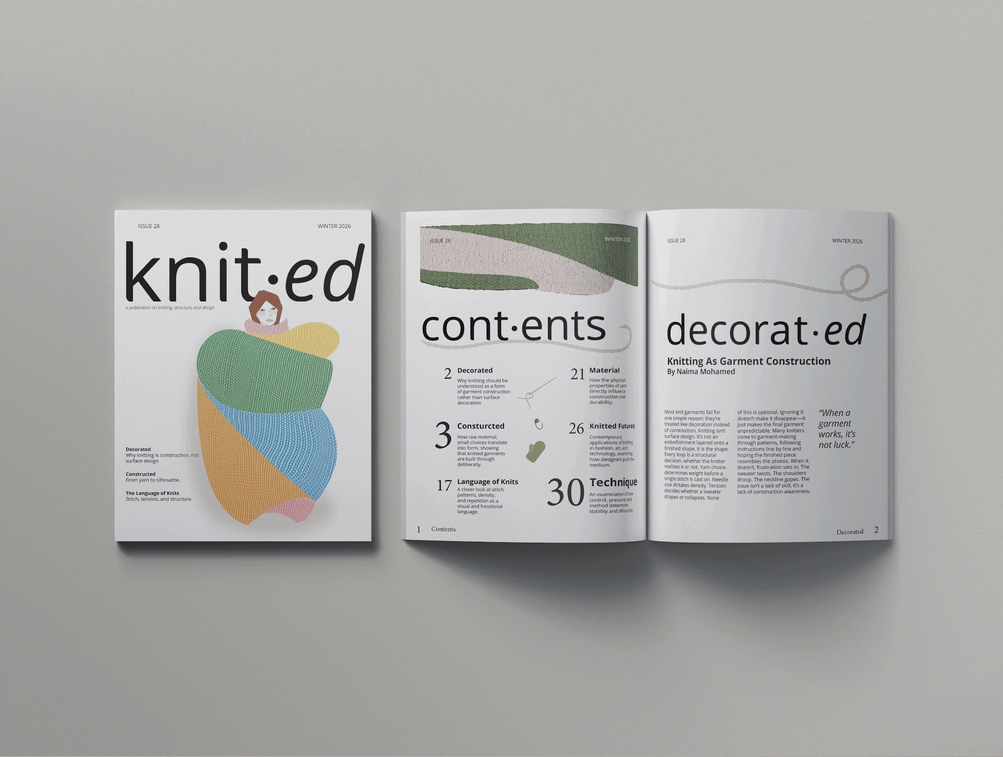
Knitted — Editorial Design
A self-initiated publication making a structural argument: knitting is garment construction, not surface decoration. The identity system uses a mid-dot interruption, knit•ed, cont•ents, decorat•ed) that forces a pause inside familiar language, reminiscent of a stitch marker, mirroring the thesis. The cover layers abstract yarn forms in organic color against a clean white ground. Interior spreads run a lean typographic grid that keeps the argument moving. The design and the editorial position are the same thing.