Linh Vu
I am a perfectionist, but design has taught me that not everything meaningful can be perfected. I often notice the smallest details, question every choice, and want things to feel “right.” At the same time, I find it difficult to bring perfectionism fully into my creative practice, because art does not always follow one clear rule. For me, visual communication depends more on emotion, contrast, rhythm, and the feeling a viewer carries after experiencing the work.
My practice lives between control and feeling. I care about structure, layout, typography, and visual systems, but I also care about the moments where design becomes softer and more human. Through branding, UI/UX, and spatial experiences, I explore uncertainty, identity, and emotional support — especially the quiet moments when people feel overwhelmed, unsure, or disconnected.
I want my work to feel intentional, but not cold. Instead of creating something perfect, I want to create something honest: a design that guides gently, communicates clearly, and makes people feel understood.
Project 1: Méli Tra
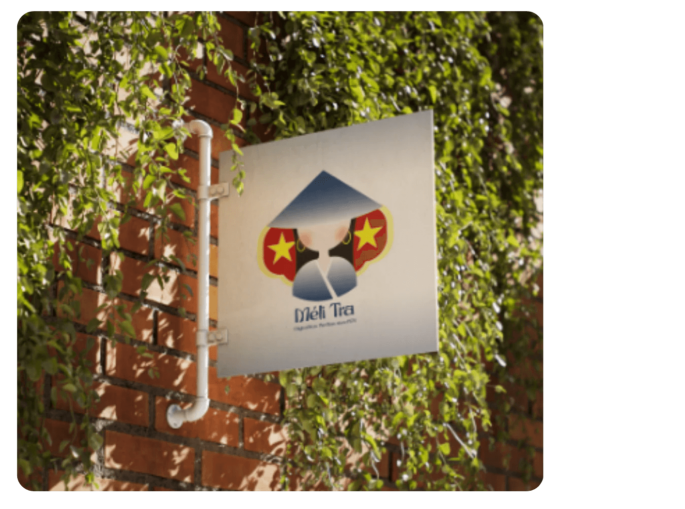
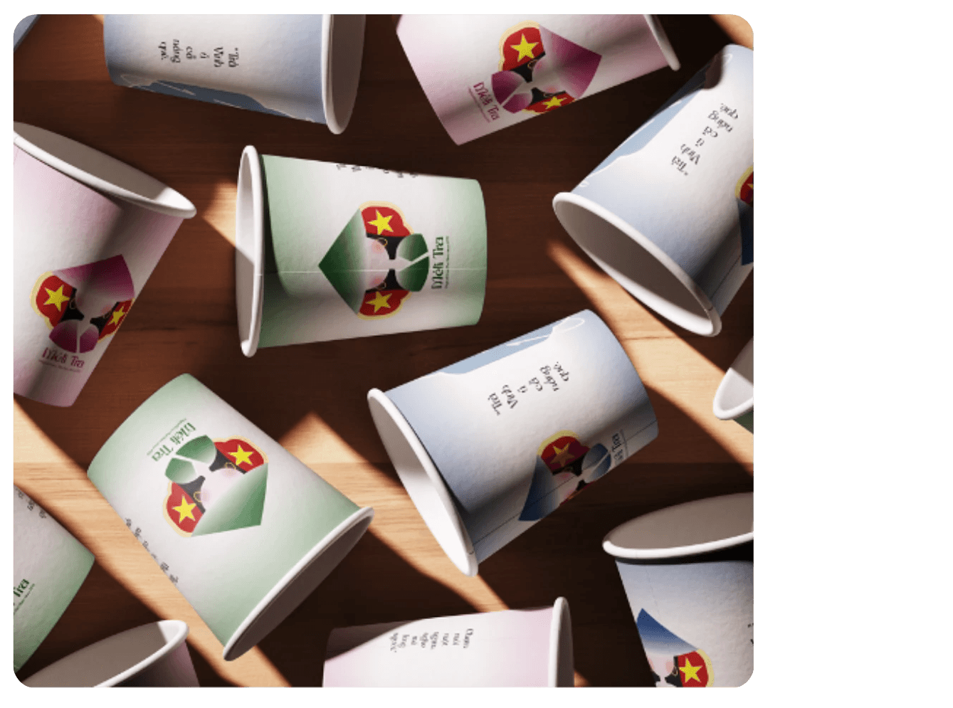
Méli Tra is a Vietnamese tea brand inspired by Trà Vinh, a well-known region in Vietnam for producing tea, and by the comforting memory of holding a cold cup of tea on a warm afternoon. The name Méli comes from the Vietnamese phrase “mê li,” meaning extremely delicious, beautiful, or pleasing, while the logo features a Vietnamese woman in a nón lá with red and yellow details that reference the Vietnamese flag. Through branded tea cups, an outdoor sign, and gift accessories like a tote bag and hats, I wanted Méli Tra to feel like a warm, youthful love letter to Vietnamese culture, home, and everyday sweetness.
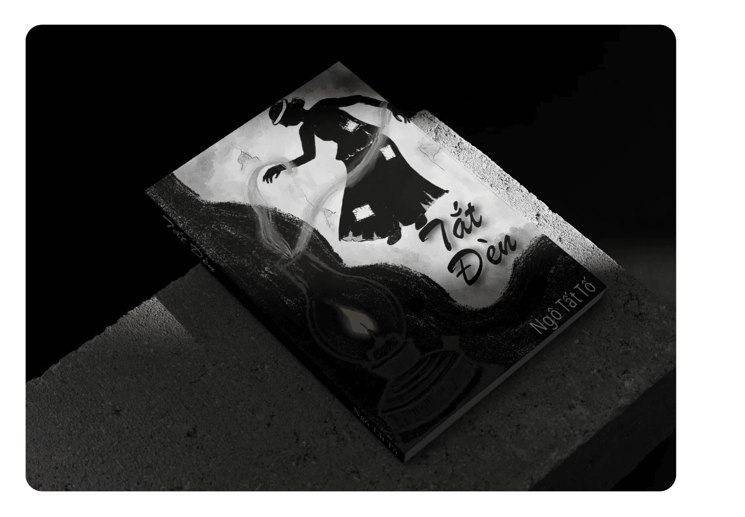
Project 2: Book cover: Tắt đèn by Ngô Tất Tố
For this project, I redesigned the cover of Tắt Đèn by Ngô Tất Tố to reflect the novel’s themes of poverty, injustice, and human suffering through a dark, emotional visual style. The black-and-white palette, rough textures, expressive typography, and small yellow oil lamp create a sense of oppression while showing the fragile hope people try to hold onto.
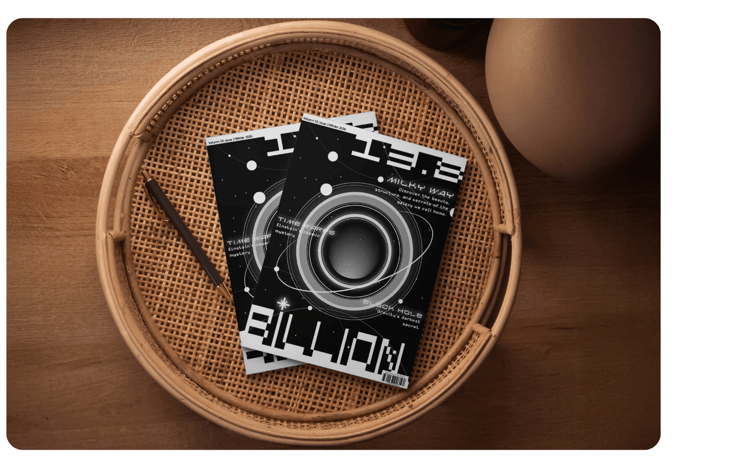
Project 3: Magazine Design: 13.8 Billion
13.8 Billion is a magazine inspired by the estimated age of the universe and the mystery of space, exploring topics like galaxies, black holes, time, gravity, and unknown discoveries beyond Earth. Through a black-and-white palette, circular galaxy form, orbit lines, and experimental typography, I wanted to make space science feel less distant and invite readers to experience the universe as something beautiful, emotional, and full of wonder.